The final product needed to have 'money shots' to market the bowl. By using lighting and shadow, we could create some cool effects to display it. |
| final product |

Tuesday 31 July 2012
Final Product
Costs Associated
There was not many costs associated with the Aranea bowl because much of the materials were provided for by UTS. The only costs were for the packaging.
 |
| costings |
Aranea Swing Tags
The swing tags for the Aranea bowl were designed to mimic the geometry of the bowl. They needed to include safety instructions and details about the bowl that the user would need to know. The grey swing tags were the final choice as they match the graphic colours of the packaging slip.
 |
| various swing tags |
Final Packaging
Here is the final packaging for the Aranea bowl. It has a clear panel either side to see the product inside. This was important because the customers want to be assured that they are receiving the right product. The graphics also display a sense of what the bowl is about.
 |
| final packaging |
Meristem Reflection
Looking back on how the last seven weeks panned out has really shown me how much I’ve learnt in this short time. It’s been a great portrayal of the design process working in group work and has given me experience on what to consider when setting up a pop up shop. The most valuable experience that
I am taking out of this subject, is the techniques used when branding a product, and how important it is to keep the portrayal constant so you can really set your product up for a certain demographic while keeping it professional.
 My four hour shift on Wednesday the 25th, from 2pm until 6pm, went really smoothly with a large percentage of people coming into the shop buying a bowl. I was initially nervous about my shift but when I realised I could easily use my customer service and sales skills which I have developed over
various jobs. As expected, I had no issues interacting with customers, answering various questions while still acting professional.
This was when I realised that the opening night would be much the same. On the opening night I was easily able to interact with the customers over various aspects of the design process and discuss the
aesthetics of all the bowls. At the end of the night it was clear to see just how successful this night was by the small amount of bowls left.
Overall I am very happy with how this subject turned out, and I’m sure that over the next couple of years I will be able to realise the extent of the experience that it has given me.
Edward Mortimer
I am taking out of this subject, is the techniques used when branding a product, and how important it is to keep the portrayal constant so you can really set your product up for a certain demographic while keeping it professional.

various jobs. As expected, I had no issues interacting with customers, answering various questions while still acting professional.
This was when I realised that the opening night would be much the same. On the opening night I was easily able to interact with the customers over various aspects of the design process and discuss the
aesthetics of all the bowls. At the end of the night it was clear to see just how successful this night was by the small amount of bowls left.
Overall I am very happy with how this subject turned out, and I’m sure that over the next couple of years I will be able to realise the extent of the experience that it has given me.
Edward Mortimer
Meristem Branding
Stamp Card

Designing the stamp card in order to represent
the particular identity that I aimed to
create with the bowl and packaging design
was very straight forward, and allowed me
to use this new medium of a “logo”” of sorts
to express my branding identity. This circular
design is clearly a fun and modern design,
with a main influence from the packaging
graphics from the 50’s and 60s. I believe
that this allows to bowl to be seen as a
cutting edge addition to any contemporary
setting.
This stamp card is used as to organise how
many bowls are sold, and assist in the organisation
of cash handling.
Swing Tag

 The swing card plays along with the similar
layout of the stamp card, with a couple of
tasteful differences, allowing the user to see
a separate intent. This card is used to tell
the consumer a number of things when they
have opened up the package at home. It
thanks them for the purchase, which is very
professional, and then gives them instructions
on how to take care of the bowl. Lastly
it gives them both the name of the designer,
and how to contact me. This is particularly
useful if any issues arise, or even if they
have further design work for me.
Meristem Box Manufacture
 The net that I used to create all of my bowl
was as basic as a sketch, as all the measurements
were interrelated and depending
on each other, as it usually is with hand
made things. Having this flexibility allowed
me to efficiently create all five of my boxes
in one sitting.
were interrelated and depending
on each other, as it usually is with hand
made things. Having this flexibility allowed
me to efficiently create all five of my boxes
in one sitting.
Although all of the measurements were correct,

slight differences in folding and cutting
meant I had to tailer certain parts to certain
boxes, which is inevitable in hand made
things.
Here you can see me cutting out the reveal,
perhaps the most important part of these
boxes. As with sanding, cutting and folding
is one thing that just takes time and effort
and you have to put the hours in.
perhaps the most important part of these
boxes. As with sanding, cutting and folding
is one thing that just takes time and effort
and you have to put the hours in.

-Edward Mortimer
Bending the Meristem


Bending these bowls was a relatively easy
process, when compared to the sanding
process. This is because the bowls are simply
placed in an industrial oven for a couple
of minutes to heat up and then pushed
down on a wok covered in cotton material
(to prevent scratches) for two minutes to
harden in the bent shape. I was able to get
them all done in an hour.
Packaging Sleeve

- Rochelle Green
Exhibition Space
The exhibition design will pretty much determine whether people will feel comfortable entering the space to potentially buy our bowls. We spent a number of weeks planning how we could best make use of the little space that we were given.
 |
| Initial proposed floor plan and interaction diagram |
The stacked boxes along the wall give the impression that the bowls are in fact for sale and provide another medium for our individual styles to shine through to potential buyers. Also, the plinths give context as to how the bowls would sit in situate on a table or bench.
In addition to this preliminary proposal we opted to place the bowls along the back wall, de cluttering the bowls along the side walls and providing an eye-catching feature for those who peer through the exhibition window.
- Michael Potter
Packaging Graphics
To market the Aranea bowl, I decided on using a similar graphic to the vector file of the bowl. This continued the literal experience of the spider web throughout the whole package.
 |
| vector file |
Packaging Template
For mass production, one final template was used to then be copied for the other boxes. It took multiple amounts of paper mock-ups to overcome any problems.
 |
| template that was repeated
- Rochelle Green
|
Box Prototypes
The first box that was designed was made to be two parts. The top half held the bowl in it and closed, and then slid into the base which then had handles. Two side panels were lated added to allow the customer to see inside.
 |
| prototypes |
Halcyon Packaging
Completed Halcyon packaging; please refer to previous posts for information regarding the coining of box graphics.
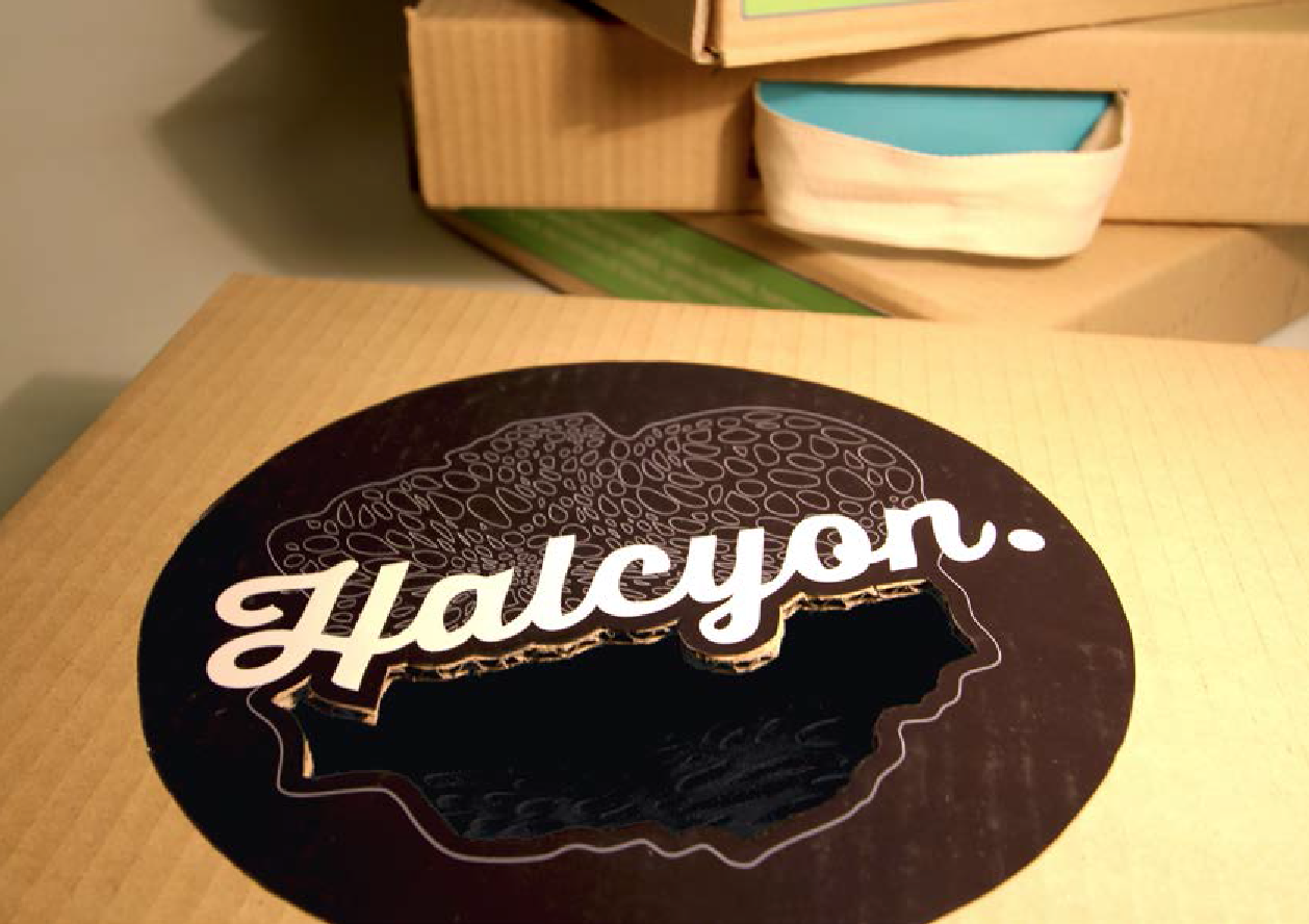 |
| Window cut into the corrugated cardboard |
 |
| Fresh to death boxes |
Problems
There were problems in the bending process. When heating up the acrylic, some edges melted together. There were also burn marks on the acrylic and being clear it was very noticeable.
 |
| problems overcome |
Bending the Bowl
To bend the bowl, the acrylic was heated in an industrial oven and once removed, was bent over a wok. This process can be seen below:
 |
| melted acryclic - Rochelle Green |
Laser Cutting
Once the acrylic had been laser cut, we undertook four stages of sanding: 180, 240, 320 and 600 (wet and dry) to achieve a high quality finish.
- Rochelle Green
 |
| laser cut acrylic |
Project Refinement
To create a well functioning bowl, we needed to think about how it would work when it was bent. As a result, I made all four corners of the bowl similar in shape to avoid it looking irregular.
- Rochelle Green
 |
| vector file |
Showcasing the rok – final shots

One of the most important parts of product design is the
ability to advertise the design with photography that do the product the most
justice. In order to present that your design is of a high quality, the image
must reflect this and support the
efforts of the designer
- Amelia Davies
Exhibiting our work – exhibition initiation


With all the bowls hung in place and the boxes stacked
underneath, the exhibition was ready to open and the designs ready to be
showcased. After seven weeks of work and a willingness to sell, every student
was proud of what they had achieved and hoped their bowl would be as popular as
the one next to it
- Amelia Davies
Monday 30 July 2012
Designing the components – exhibition creation
 |
| acrylic hexagons during spraying process |
With all components of the exhibition design, the actual
fabrication process involved all students measuring, drawing, cutting, sanding,
preparing and painting the hexagons which the bowls would be mounted onto.
These shapes were created from white and clear 3mm acrylic which the students
cut with ban saws and then sanded and prepped to then be primed and sprayed
with the chosen orange colour
- Amelia Davies
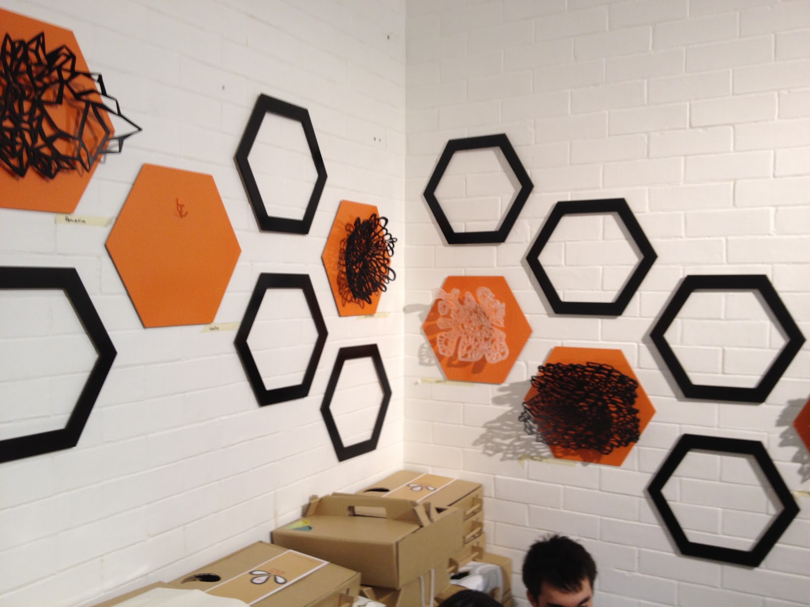
Preparing for display - exhibition design
 |
| wall plan for bowl exhibition |
One of the most important parts of this entire process would
be showcasing each and every bowl to their greatest potential. The design for
the exhibition had to be innovative and interesting to ensure that each bowl
stood out regardless of the colour or finish. The decision was made to present
each bowl on its own tessellated hexagon surrounded by a black hexagonal frame
to draw a clear distinction. The placement of the bowls was based on a
symmetrical arrow-like formation around the room to draw the viewers around the
room focusing on each bowl
- Amelia Davies
Completing the rok – final product
 |
| all bowls boxed and ready for sale |
From design inception, realisation, production and
completion the final design was produced with a high quality finish and interesting
pattern. Made from black, laser cut acrylic, the bowl is durable and stylish and
could easily be a contemporary accent for any home
- Amelia Davies
- Amelia Davies
Speed processing
 Making the bowls was not as a lengthy process as compared to the first time we made them. the tasks that had to be done in order to prepare the bowls included sanding the edges using 400 grade sandpaper and using 400 grade and then 600 wet and dry on the top and bottom surfaces. Car polish was used to polish the bowls to return them back to a professional finish. The bowls were ready to bend when in the oven for 4 minutes making it a continuous cycle of productivity of when the bowl goes into the oven to bending to another one going into the oven.
-Mariana Abdo
Halcyon Design Exploration
In the early stages of design development it made sense to go straight to natural textures found in nature. From these textures, inspiration was drawn from and articulated as small thumbnails which gave a brief insight into potential design directions.
 |
| Design Development |
Templates for inspiration

Halcyon Laser Cutting file
Illustrator is the best available program for producing intricate patterns and designs ready for laser cutting. The first stage of creating the Halcyon pattern involved producing a swatch. The transform warp tools were then used to generate the bulges and depressions in the pattern to achieve a pattern reminiscent of my concept design.
The best way to get a sense of scale of the bowl I found personally was to print it out the file and identify where holes may be too close together or too far apart. I printed my file out several times before I was pleased with the layout of the holes.

-Michael Potter
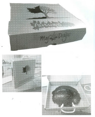
Tree Transition

The image to the right is of the very first draft for the window in the box. As we can see it is an image of a bare tree which has been combined with an image of an autumn leaf.
In photoshop the pen tool has been used to create thick outlines in which the bare tree will be printed onto adhesive transparent labels. The left side of the graphic is the shape of the window. The result of combining this shape and the window is that you can see the bowl and the texture will add to the bowl.
-Mariana Abdo
Finishing the Acrylic
There are five varying levels of finish involved in the process of finishing the acrylic before being bent.
1. At the 180 grit stage, the edges should be roughly rounded. This often results in surface scratches, so it’s best to not get frustrated and attempt to run the sandpaper over the entire pattern.
2. The 240 grit stage should utilise the same process used in the previous grade should be repeated. This should only take half the time as the 180 has done most of the hardwork. It’s now advised to go over any smaller holes, brushing over the holes with your fingers.
3. Again, all holes should be smoothed over again at the 320 grit stage. It’s important to get as many scratches out as possible. Once all the edges have been smoothed out attached some sandpaper to a flat sanding block and go over the acrylic in a circular motion.
4. The next stage requires some 600 grit wet and dry sand paper and a bucket of soapy water. Crumple the sandpaper around the edges of a sanding block and rub the acrylic, making sure the acrylic is continuously damp.
To finish you will require some automotive grade polish and a clean rag. Rinse the bowl and once dry, apply the polsh in a circular motion, buffering the acrylic with the rag. The acrylic should be completely devoid of all scratches and blemishes. Clean throughly under water and it's ready to bend.

Halcyon Press
In order to achieve the desired organic form of the
halcyon bowl a press was to be produced. Initially, a bird wire mesh was bent
and stretched, forming it into a shape which was reminiscent of visual flow of
the pattern.
An enclosure made of timber was used to attach the
wire mesh to and plaster was then poured into the box. Just before the plaster
hardened the plaster was dragged over the wire mesh and the excess plaster was
disposed.
A negative mold was produced by extending the
enclosure of the initial walls and coating the original form in Vaseline.
Plaster was then poured in and a lid was placed on top, with the walls later
removed.
 |
| Press production process |
Photography Inspiration

There is a beauty in winter that is often overlook and that is the transition between flourishing foliage to bearstricken trees that can only be appreciated in this season AUTUMN!
-Mariana Abdo
Final box for Autumn
-Mariana
Gaffa Space Setup
 The gaffa gallary had many restraints that limited how we could use the space. We were unable to nail anything into the walls as it is a heritage listed site and the rome was only 7 square ft. This required us to use the room effectively and efficiently. it is my idea to hang things from fishing wire which hangs from a suspended beam and have the boxes places on the back platform in a visual way.
-Mariana Abdo
Reflection
Reflection:
I have lot of fun in this course also I learn
lot of new things. Before never do any muscle work but this time I tried to do
it. We mixing the cement and sand together and then put in cylinder that will
give some weight to the cylinder and it won’t fell down. And the out come for
that cylinder is very practical and beautiful. I think for the group work I did
not do much because I don’t know how to use those machines and that is why I
just do some thing I know how to do, such as sanding and polishing the hexagon
and other simple work.
For the group work I did not help a lot and
probably I did not do well however for my own work, I am very happy the
outcome. I think the challenge for this
subject is packaging design; you have to make your own packaging so the box got
the right size to fit the fruit bowl and also you have to make sure the
cardboard can make the your design. If some of the design needs to fold a lot
that probably want work in the cardboard. Before I think lot of complicated
packaging but later Richard suggest us try to make some thing simple because we
are not sale the packaging, we sale the fruit bowl. Therefore, I just make a
simple box with fancy pattern on it.
Jianmin Li (katie)
Costing list & Time sheet
costing list:
|
Tissue
paper
|
$
1.5
|
|
Cord
|
$
11.9
|
|
Ribbon
|
$
6.25
|
|
Print
|
$
36
|
|
Varnish
|
$
24.1
|
|
Tape
|
$
3.45
|
|
Eyelet
|
$
6.04
|
|
Acrylic
|
$
100
|
|
Total
|
$
189
|
|
Per
bowl
|
$
37.8
|
time sheet
|
Week
|
Studio
|
My
own timetable
|
|
1
|
Introduction
|
-Packaging
research (internet) and rough sketch for the packaging
|
|
2
|
Production
planning marketing strategy
|
-Research
template for the box and combine with my rough sketch to make a box
|
|
3
|
Packaging
|
-Develop
the box
|
|
4
|
Studio
|
-Design
pattern, swing tag, sale ticket, develops box design and scale the size for
the box.
-Sanding
the fruit bowl
|
|
5
|
Studio
|
-Print
out and cut the pattern, swing tag, sale ticket also make final box
|
|
6
|
Space
|
-Finish
week 5 work
|
|
7
|
Studio----final
out come
|
-Hand
in the final work
-Group
work for prepare the gallery space
|
|
8
|
BUMP
IN (23/7)- BUMP OUT (28/7)
|
-Attend
the gallery (Thursday 26th 10am-2pm & 6-8 pm; Friday 27th
2-6 pm)
|
Jiamin Li (katie)
Subscribe to:
Posts (Atom)