Monday 25 August 2014

Bowl Production_Matt Clarke_2014_Fruit bowl_2


Outside work station for sanding and cut and polish
To create ten bowls like the original one was difficult to do time wise at first it started off slow with the lower grade sand papers and then began to get faster as I became more efficient in knowing where the right spots were to sand and what pressure to sand with. At the end of each step i was at least 50% faster than i had been with the first bowl this continued all the way through. When it came to bending the bowls I increased  production speed by having two bowls in the oven at a time separated by eight minutes and had the mold to put them in sitting onto top of a milk crate for easy access to pick up and place on top of the bowl sandwiching it in between the two part mold this process dramatically sped up the process of bending.


Set up for the bending of the bowls

Bowls after they are bent and finished 


Market Research_Matt Clarke_2014_Fruit bowl_1

Market Day in the Blue mountains Stall of gardening equipment 
To do initial market research I went to a market day in the blue mountains while I was visiting the area. Many stalls where set up of both products and food with their being many different layout from stepped displays to just having items in baskets and without packaging or individually wrapped items depending of the product which was being sold. The above image was the stall that stood out for me as it was gardening products displayed with the use of some props plus they let you test the products before you bought them so had another level of interaction than other stalls. 

Tuesday 12 August 2014

Kezia De Costa 2014 - Swing tags (Blog post 05)


Image 1: Initial mock-up of swing tag


Image 2: Text inside swing tag

Since I had established a brand guideline for my packaging it was really easy to replicate that into swing tags and selling cards. I initially started out with a conventional swing tag which would be attached to the bowl. I felt it looked too generic and something which had been seen on countless items for sale. 

I did some market research on product branding and found that people enjoyed opening things and interacting with items and I figured a swing tag should be no different. I found that this interaction helped your target market engage with your product on a deeper level. With this in mind I experimented with the idea of using a pouch as a swing tag so the audience would pull out the tag with the information. I also figured that this could sit neatly on top of the bowl. I also choice a textured paper stock for most of the swing tag since the cream tones were more in keeping with the colour of the box and its aesthetic. 


Image 3: Swing tag with pouch


Image 4: Sale card with same layout

Overall, I'm very happy with the final design and packaging of my bowls. I think they illustrate ideas of summer and are vibrant enough to hopefully have people purchase them on our market day!


Image 5: Finished packaging


Image 6: Finished packaging

Kezia De Costa 2014 - Packaging graphics (Blog post 04)


Image 1: Initial sketches of graphics for packaging and branding


Image 2: Securing printed acetate onto box lid. I found using tape around all the edges was the best way to hold it in place


Image 3: Finished box with lid


Image 4: Finished bowl with wood wool

Creating the graphics for my packaging and bowls was what I was most looking forward to. Trying to replicate industry standard for a small scale project is hard but I was confident I could still produce a successful piece of branding. 

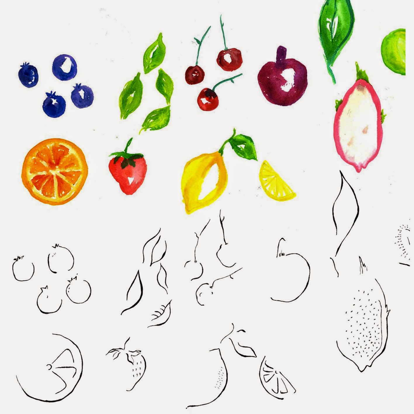
Since my bowl is inspired by summer and leaves I decide watercolour would be a great addition to the branding. A colourful brand presence seemed only right for a bowl marketing itself as all things summer. I hand-generated fruit using watercolour and also used pens and inks to create fluid outlines to emphasis contrast and also stop the graphics looking too flat and boring. As this was the main identity for my bowl, I decided to use a very simple typeface but ensured it still kept the summer vibe I was aiming for. The typeface has curved features and a small x-height making it perfect for my headings. The colours I used are all very bright so as to be engaging and fun. I think colour is the best way to reflect and enhance a unified image of my product since it is a visual medium. Colour is able to hold an audiences attention fair longer and most importantly evokes emotional responses. The bowls aren't intended to be branded as very expensive or delicate but instead fun and exciting. 

For the lids of the boxes I chose to spread my graphics around the clear acetate with the text firmly centred. I decided to carry this layout throughout the rest of my branding. To fill up the boxes I decided to use wood wool, which is thin shavings of wool. I felt this added to the rustic approach I was after which I thought tissue paper couldn't achieve. I also secured the bowls using ribbon which was threaded through the bowls and secured onto another box. 

Overall, I'm really happy with the final outcome of the packaging. The colour are bright and vibrant and illustrate the summer vibe I was aiming for.

Kezia De Costa 2014 - Packaging (Blog post 03)


Image 1: Lids of the boxes waiting to be put together


Image 2: Outline of the circle which was cut for the lid. The circle was slightly smaller than the bowl


 Image 3: Circle hand cut out of lid. In a real manufacturing situation this would be die-cut

I had a very clear idea about what I wanted the packaging for my bowls to look like. I was hoping for a rustic country aesthetic with textures of leather and canvas. My initial idea was to make the boxes out of ply with a clear acrylic sliding lid. After prototyping this, it became evident that producing this for 10 bowls would be extremely time consuming and had the chance of not being perfectly executed. Also the cost would be very high. With time for experimenting running out I realised I really needed to decide on a design using cardboard. I prototyped a few ideas and I decided I was happy with a simple square box with a see-through hole. This seemed simple yet also effective. 

I made the internal platforms for the boxes but I decided to purchase the actual box itself mainly because of time restraints. I chose the box to be the colour 'craft' with a lid made from flute cardboard because this still felt rustic. For the see-through hole I decide it would be a circle since the bowl was round-this would also keep the box from looking to rigid and flat. Cutting the hole out of the lid was surprisingly easy with the curves turning out very smooth like I'd hoped.

Overall, the production of the actual box itself was fairly simple. The boxes were very easy to construct as they already had the fold lines and glue and didn't require me fiddling around with it too much. I was happy to keep the box simple since I was confident my graphics would help make it unique.  

Kezia De Costa 2014 - Bowl Manufacture (Blog post 02)


Image 1: Red circles indicate where cracks emerged


Image 2: Bowls bent and ready for packaging

The manufacturing of the series of bowls was exactly the same our first bowls, however I did encounter numerous problems from the every beginning. The bowls began cracking in exactly the same place (as indicated in the image above) before I'd even begun sanding them which was incredibly frustrating. After the first two bowls cracked I was left with eight which I sanded and polished very carefully but once again, two bowls cracked whilst being bent over the wok. After talking to Richard, I realised that my original design for the bowl had spaces which were too close together and so the tension made the bowls increasingly fragile and prone to breakage. In order to stop this from happening to the rest of the bowls, small pieces of balsa wood was wedged into the gaps so the acrylic wouldn't bend and crack. This method was effective and prevented any more cracks. It was definitely disappointing to have so many bowls crack after hours of sanding and polishing, but it highlighted the importance of executing the functional aspect of the design. 

The technique I used to sand and polish all the bowls was to work at it like a manufacturing line. I sanded each bowl with the same grain of sandpaper and then moved onto the next. This insured the quality of the bowls would remain consistent. After all the sanding, lots of the residue from the sanding was stuck between the gaps of the acrylic which was quite a lengthy process to remove before moving onto the cut and polish paste. However, once that was removed the polishing was fairly easy and I endeavoured to ensure the same level of quality was maintained with this final process. 

All up, the process was definitely long and challenging but it was great to finally have all the bowls completed and ready for packaging.

Monday 11 August 2014

Market Research_Isabella Rago_2014_Fruit Bowl_1


TAFE Markets

Paddington Markets

The market stalls that most captured my attention were those that used their natural surrounding as a tool to accentuate the product being sold. The natural products benefited most from this, especially those of the bonsai being sold at Paddington Markets. The layout is clean and the product is not suffocated by the stall props. Our bowls, being large objects, can benefit from having an intriguing stall set up as they will not get lost in the detail of the stall. On the other hand, the products being sold at the TAFE markets are lost amongst the props as they are shadowed and displayed awkwardly. The placing of the bowls in relation to the sale poster and other marketing products on display must be carefully considered so not to loose focus on the fruit bowl and it's laser cut detail.

Sunday 10 August 2014

Kezia De Costa 2014 - Research & Inspiration (Blog post 01)


 Image 1: Winter Wonderland, London 2014


 Image 2: Camden Lock Markets, London 2014

For inspiration on setting up a market stall I looked back at pictures I had taken of markets I'd previously visited overseas. The stalls that I liked most and was most inspired by were the ones which had a lot of colour and lots of items on display. The tables were well organised and the stall holder always had plenty of information cards for interested buyers. When I visited the markets at The Rocks I felt the same thing. Most market stalls sell lots of items and their table are always full of things-I'm not sure how I'll go about translating that into my display since the bowls are quiet large. However, I do think having A4 sized posters and cards could compensate for this.

Tuesday 5 August 2014

Stall Research_Kwan Ho_Chan_2014_Fruit Bowl


I went to Paddington Markets on a Saturday to investigate the different stall set ups at the market. There were many different types of stalls that had a unique set up, suitable for their item for sale such as jewelry and accessories, clothing, food, art (canvas painting), home ware and plants. The store that caught my eye sold ceramics and had a neat set up of flat bowls with smaller items either in front or on top of the bowls, with the taller items such as vases placed at the back. The store owners just placed a nice pattern cloth over the table which complemented the colors of the ceramics which I found to very effective.