
Image 1: Initial sketches of graphics for packaging and branding

Image 2: Securing printed acetate onto box lid. I found using tape around all the edges was the best way to hold it in place

Image 3: Finished box with lid

Image 4: Finished bowl with wood wool
Creating the graphics for my packaging and bowls was what I was most looking forward to. Trying to replicate industry standard for a small scale project is hard but I was confident I could still produce a successful piece of branding.
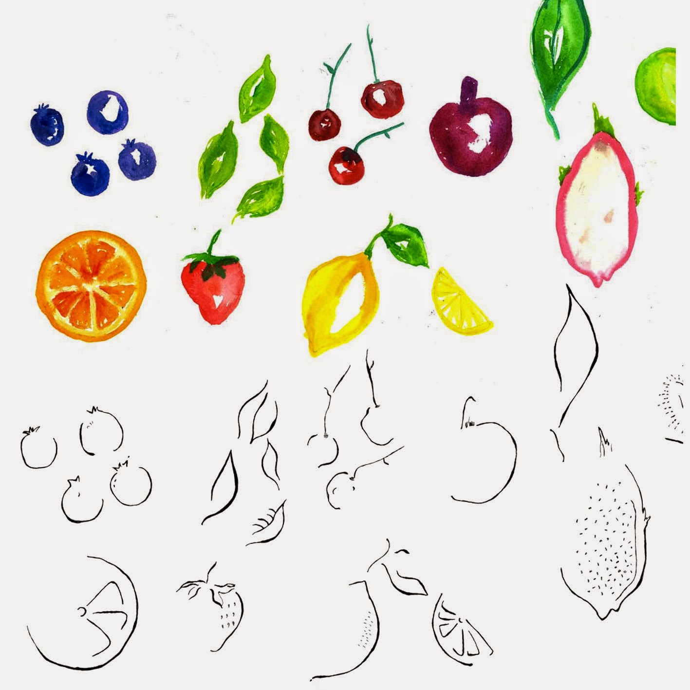
Since my bowl is inspired by summer and leaves I decide watercolour would be a great addition to the branding. A colourful brand presence seemed only right for a bowl marketing itself as all things summer. I hand-generated fruit using watercolour and also used pens and inks to create fluid outlines to emphasis contrast and also stop the graphics looking too flat and boring. As this was the main identity for my bowl, I decided to use a very simple typeface but ensured it still kept the summer vibe I was aiming for. The typeface has curved features and a small x-height making it perfect for my headings. The colours I used are all very bright so as to be engaging and fun. I think colour is the best way to reflect and enhance a unified image of my product since it is a visual medium. Colour is able to hold an audiences attention fair longer and most importantly evokes emotional responses. The bowls aren't intended to be branded as very expensive or delicate but instead fun and exciting.
For the lids of the boxes I chose to spread my graphics around the clear acetate with the text firmly centred. I decided to carry this layout throughout the rest of my branding. To fill up the boxes I decided to use wood wool, which is thin shavings of wool. I felt this added to the rustic approach I was after which I thought tissue paper couldn't achieve. I also secured the bowls using ribbon which was threaded through the bowls and secured onto another box.
Overall, I'm really happy with the final outcome of the packaging. The colour are bright and vibrant and illustrate the summer vibe I was aiming for.
No comments:
Post a Comment